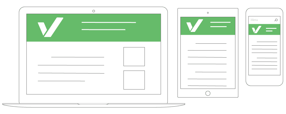
Really focus and think about the users on your website… Imagine if that was you coming to your website for the first time. Look at your Analytics. What percentage of people are on mobile? If it is anywhere near half, you really need to start focusing on mobile even more than desktop.
It is very common that websites respond differently depending on the device that it is being viewed on. We use CSS Code to detect the size of the browser, and then appropriately change the size of different items on your website to make it a better experience for the user.
Please reach out if you have any questions, we would love to help!

